MainFrame Devlog

Runtime Reflections

I didn't work on the game much this week. I did however work out some runtime reflection logic.

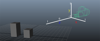
I created a second camera that is my runtime reflection camera. It renders to a texture that I can use in my shaders. The uv's for the texture are the screenspace uv's. The I wrote a C# script that sets the orientation of the reflection cam to be the reflected forward direction of the main cam. The X and Z position are that of the main camera and the Y position is the inverse of the main camera's Y position with respect to the ground plane. I also had to invert the V coord of the render texture in my shader.

This worked out quickly and it felt good to get something done that I wasn't sure I could do myself. I also removed bullets from the runtime reflection camera because it looked like more bullets coming at the player than there actually were.

MainFrame Devlog

Enemy Models

I've been hard at work modeling the enemies based on Janice's concepts. I'm not a particularly good modeler but I think I can do the shapes Janice has designed which is great. It does mean that I am taking on more work but i can't afford to hire a modeler right now so on we go! 

That being said I have modeled most of the enemies designed. Using these enemies I'll create combat scenarios that should work out really well and challenge the player on all of their mechanics. As I go I notice little things I really want to fix but I would consider them polish and I have to restrain myself, specifically with FX stuff.

One of the enemies I really liked making was the laser enemy. The concept is so cool and once it was it game it just worked so well. While I was working on the laser enemy I refactored the enemy shaders so that I could supply a mask texture to control where the positive and negative charge colors were applied to each mesh.

Last week I created a bomb mechanic for the player. The player can drop a bomb with an unlimited supply but there is a cooldown time between when the detonate the bomb and when they can drop another one. I plan on allowing the player to upgrade this ability so they can decrease the cooldown time and increase the blast radius.

Here are some screenshots of the rest of the enemies in game!

MainFrame Devlog

MainFrame Devlog: May 31 2015

Over the past few months I've been working on a lot of things. One of those things is a game I''m currently calling MainFrame. That is subject to change but it works for now. 

The Game takes place inside a computer. The player awakens inside this computer and doesn't really know what's going on but they know they are in immediate danger and must learn quickly to defend their selves. They are tasked with bringing down an evil corporation to prevent them from fulfilling their evil agenda. Clearly I haven't fleshed out that whole thing yet but I'll work it out.  It's a twin stick shmup inspired by the likes of Tomb Raider: Temple Of Osiris, Contra 3, Smash TV, Luftrausers and Ikaruga among others.

A concept for a level where the player ends up in an error ridden part of the computer

I'm trying to be realistic with my scope and what I know I can do. The player is a bipedal character while the enemies are floating entities similar to robots so I can cut down on the animation required to support all the different types and really focus on their behavior. This works really well. I recently got help from Janice Chu doing concepts for the game. This has taken the ideas to the next level. She's been able to help design new and cooler ideas for the games world and really start to flesh out how these characters will move around what the environments will look like.

Another cool thing is the weapon polarity mechanic I was inspired by in Ikaruga. In this game the player will eventually encounter enemies that have a positive or negative charge. The player will also be able to swap the charge of their weapon. If the player shoots an enemy with a positive charge and their weapon is set to positive then they won't hit the enemy. So they'll have to swap their weapon to the opposite charge to kill the enemy. I'm currently signaling this to the player by a color. Purple is negative and orange is positive.

I'll be trying to keep the updates coming regularly. In the meantime here are some things going on right now to have a look at. The video also shows the weapon polarity mechanic in action.

Main Frame

What!?

I have been working for a few months in the very brief moments I can on a game called Mainframe. It's a fast paced twin stick shooter game inspired by the likes of Contra, Ikaruga, Geometry Wars, and a few others. It's look is inspired by that of 80's album art. So neon grids and wire frame tessellated mountains with a space themed backdrop. I don't have the full look fleshed out right now so enemies are just primitives with some shader stuff going on and you won't see much of an environment yet. I wanted to start a quick post that will hopefully roll out to be my devblog for the game. I made some prototypes and tested it with friends and have found some new inspiration for the gameplay and how I want it to go. I will create a more in depth post on that later though. Right now I just want to demonstrate a new weapon polarity mechanic and the flood spawner.

The weapon polarity mechanic is inspired heavily by Ikaruga. An enemy of a positive polarity cannot be hit by a matching polarity weapon from the player. The player can slot two weapons at a time and switch between them whenever they want. The only way to destroy an enemy is to hit them with the opposite polarity. Again I don't have the art fleshed out yet so right now purple enemies are negative and orange enemies are positive. So the player has to switch to the opposite color from their weapons.

The flood spawner is just something I recently added as an enemy type that will continuously spawn an enemy every nth second up to a cap of how many can be alive from that spawner at any given time pulling from a max amount to be allowed by the spawner. So if 10 are alive then the spawner will wait until one dies before spawning another. At some point in a level the player will be bombarded by this enemy type and need to hold them off until their objective is complete. These enemies just want to get in close and explode near you to deal damage. I have a video below so have a look. I'll post more of the overall game concept in my eventual devblog.


Dual Shockers Article for ThumbderDome

So far the game is being received as I expected. I really appreciate the article written over at Dual Shockers regarding the game. They took the time to look beyond the puns and see the fun in it. The game of course is very short and simple but it can be a lot of fun in groups and party atmospheres. Here is a link to the article over at Dual Shockers

http://www.dualshockers.com/2014/11/06/naughty-dog-developer-releases-thumb-wrestling-game-its-awesome-and-free/

Release

After a lot of deliberation I have decided to release the game for free. Selling it just came with too many issues I couldn't resolve and I didn't want to sit on the game for as long as I have. I plan on releasing the game this Wednesday the 5th of November. I will have a special video to accompany the release of the game and it will be available for download on PC and Mac through an itch.io link. I hope everyone enjoys playing it. I also think everyone will enjoy the video I'll be putting up with it. :D

Final

ThumbderDome Complete

I've created a build for PC and now possess an installer. It's pretty cool to see an installer for the game and have everything work as expected. I currently do not have an installer for the Mac version but I do have a build of it. I'll be handing out a few copies to some friends for testing to try to find any glaring bugs and last minute changes but it looks like it's done. I won't speak too soon but it really does look done. I still need to make a launch trailer and do the work on where to release it and some legal stuff but the game itself is done. I want to thank my friends for giving me the encouragement to make this game and all the great feedback they gave me. I also want to thank my wife for putting up with me talking about it all the time and stealing time to work on it. If she wasn't as accepting and forgiving as she is I don't know what I would do. I look forward to people getting to play it really soon.

Approaching Gold

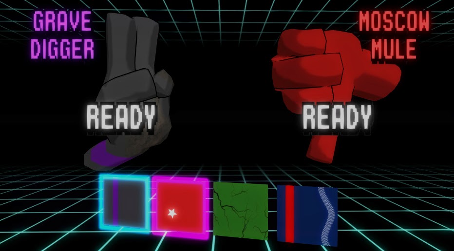
As I get closer to gold on this thumb wrestling game I find myself tweaking as much as I can to make things better. So very quickly here are a couple things I did today. I updated the character select scene by adding a background for the character icons to sit on. They were just floating there and I needed to have them grounded to something. This neon magenta scan-line art I've been using throughout my game for other UI elements works well and it keeps the visual theme locked in. I also updated the texture for Grave Digger and Monster Masher. The Grave Digger texture now has these silly drawn in bones like someone wearing a skeleton t-shirt and monster masher has blood spatter on the texture. I changed player 1's selection color to be an orange-ish-yellow since this is a theme I've used for player 1 in my update to the UI in general. Likewise, player 2 is now a neon blue to match the UI updates.

New character selection screen updates

Moving on. I've created and implemented the control layout/help screen. Each time you progress from the main screen this screen pops up to show players how to play the game. The controls aren't complicated and I really should add this screen to the pause menu options in the main wrestling scene but time is tight so we'll see. I sill need to make a small credits screen in the start scene.

Control layout screen

Lastly, I animated a few things in the start scene to give it a little life. I added some movement to the glare elements and a sheen swipe effect that moves over the main text every 3 seconds or so.

Moving elements in the start scene

Moving elements in the start scene

That's it for now. The game is nearly done but I still feel like I have a ton to do to actually be able to sell it. I don't plan on selling it for much. Something really really cheap but once that enters into the equation all sorts of scary things have to be addressed and I need to know what those are before I can sell anything else in the future.


ThumbderDome Alpha

One Thing Missing
So I have the first build of the game and everything is working great. I don't have any audio yet but I've been looking into sound effects and the various licenses I need to obtain for certain things. Further info is being collected but I haven't implemented anything for that yet. I also didn't quite make it all the way to my alpha goal. The game is playable from beginning to end but it's missing the taunt scene in between the match and the continue screen. this scene is cosmetic and has not input from the player so I'm lumping it into my beta deadline next Sunday. So let's take a look at some things That have changed.

Character Selection Animations
Characters now play a selection animation when you select them. If you move to another selection they return to their idle thumbs up animation. This animation is re used when the player wins the match and also when they continue at the continue screen. A bunch of refactoring went in to support this because before I wasn't expecting to have anything play when character is selected.

Split Screen Adjustments and Struggle Meter
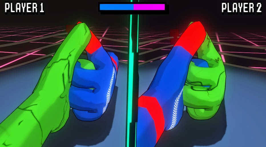
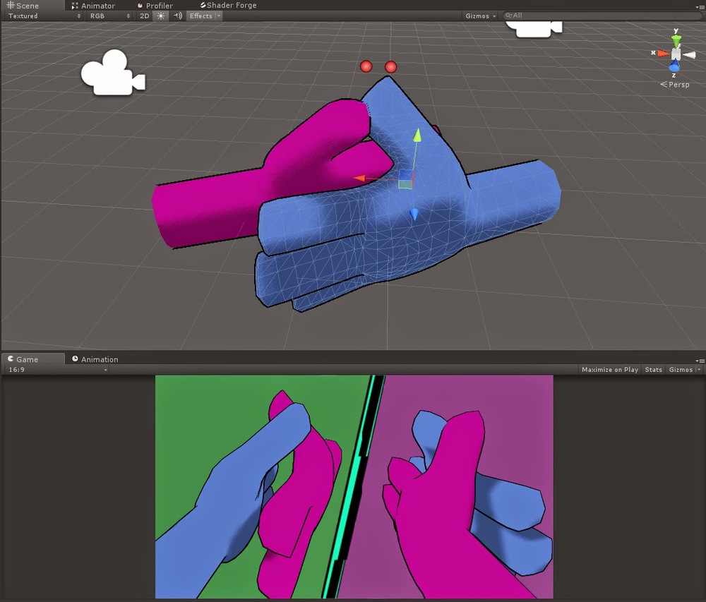
I change the orientation of the split screen margin. It used to be diagonal but it was weird for one player to have a different view space than the other. I also change the second player cam to more closely reflect the first player camera on the left. They still aren't 1:1 but I will sort that out in the beta build. Additionally I added a struggle meter at the top. When a player is pinned they wiggle the joystick and the meter will push in the other players direction until filled and they escape the pin. Before I was just incrementing a counter and didn't have any ui to support this. I also added some code that would allow the player that is pinning to fight back against the struggle meter to force the pin down. This is commented out as I can't really test it on myself because my brain is always letting the other half win. The idea is that the pinned player will have a max value to achieve that is multiplied by the number of times they have been pinned in a round. The player that is pinning has a static value for which to fight back so the more times a player is pinned the harder it will be to win against the pinning player. At least in theory. Again I haven't tested it yet so it's commented out in code and I'll test it with some players. I also changed the "Pinned!" ui text to be on top of the player that gets pinned instead of showing up in the middle.
The idea I went with for character select scene.
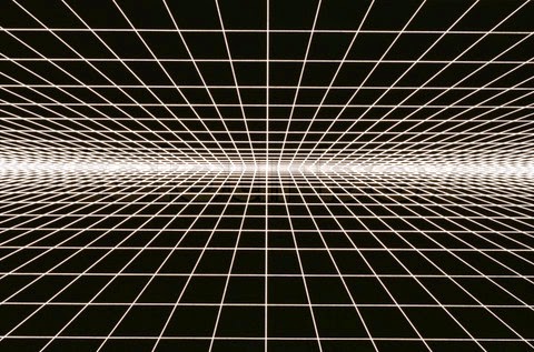
 Another example of some grids leading off into the distance.


Player Specific Win Animations and New Look
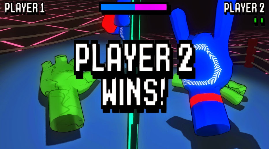
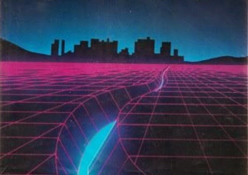
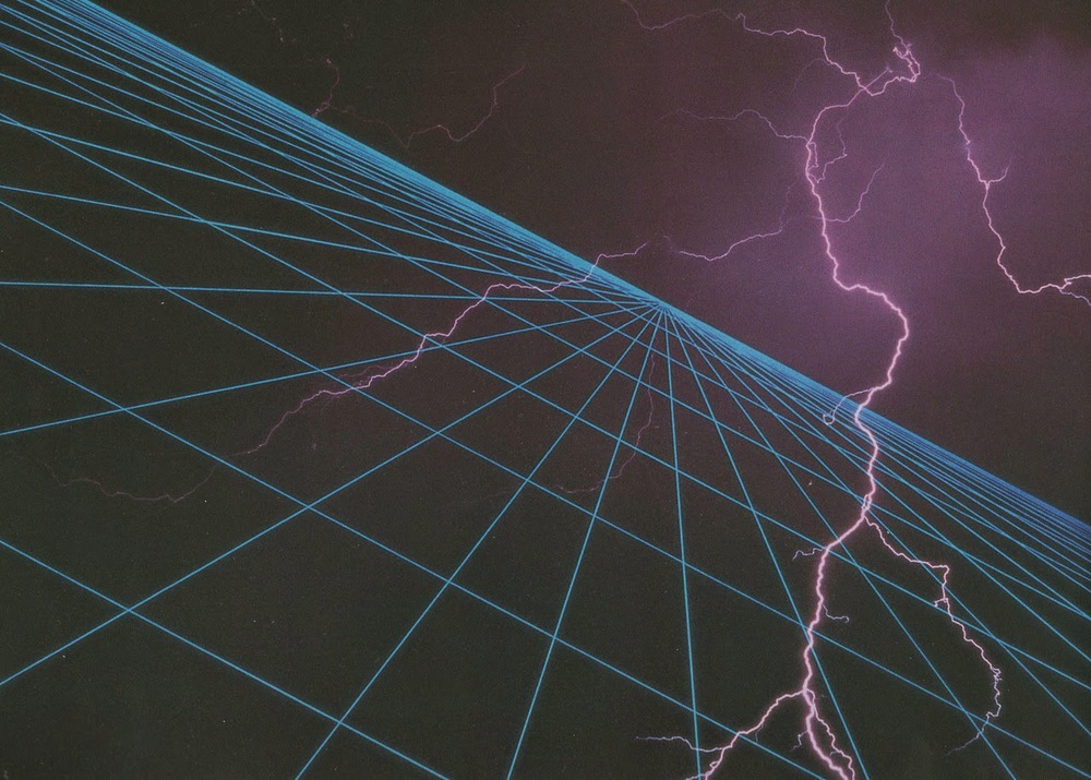
 As I mentioned before animations are being used for each winning character. For Grave Digger I googled "Relgious hand gestures" and found one that I hope isn't offensive. The other are ones that I just came up with. This also required some hefty refactoring to support the changes. You'll also notice the neon grid in these scenes. Let's just throw this out there. I like 80's pop culture art and misc. I don't know why exactly. Maybe just something fun to look back on. Maybe it's the super simplicity of it. Maybe it reminds me of being a kid. I just like the way technology and the future were represented in the 80's.  In any case after making the start screen I realized there was a visual inconsistency through the scenes. I decided to create something simple but still appealed to my direction of wrestling's golden age in the 80's. I looked at some images for inspiration and added some of them below to look at. My characters don;t really have any specific 80's look to them they just represent a theme that a wrestler might have taken on and represented to such an extreme. Plus they're floating hands sooooooo you know.

Continue Screen
I added a continue screen where a countdown begins. If the player doesn't press their respective trigger then the game ends and it returns to the title screen. If they continue then it returns to the character select screen. This was all done on Saturday night. I looked at the clock when I called it done and realized it was 5:00 am. I have to stop doing that. (Don't look at the timestamp on this post.) The 80's neon grid is in view here as well. I made a shader that would falloff to black so it would look like the grid fades into the darkness. Also made some trigger icons that follow the theme of the font I'm using.

Conclusion
So there is still plenty of work to do to reach beta. I need music and sound effects along with a bunch of other things on my list. I need to make the taunt screen I mentioned a polish some animations. I started looking into selling the game for a really small amount and still haven't worked out all of the logistics there. We'll see where I land once this things is done. I also still need to make a simple animation of a ui element telling the player to wiggle the joystick when they get pinned. I'll post another update soon.

Title Change

Welcome to Thumbderdome
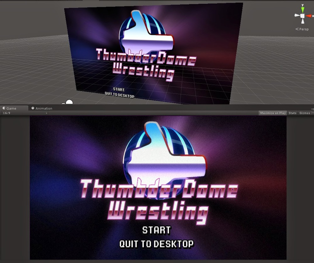
So I decided to change the title. I went through a couple variations. One was a play on WTF Wrestling Thumb Federation but it still lacked something cool and there is already some web series called TWF Thumb Wrestling Federation. Mine was way too close to that. I also just didn't like "Thumb At Me Bro!". It was just a little off and didn't sound right to my ear. After writing down all of the things that came to mind when I thought about wrestling entertainment from way back I knew I wanted to have some kind of imagery to capture the golden age of wrestling. I also think constantly about the cage matches and the whole "Two men enter. One man leaves." So with that, I landed on ThumbderDome Wrestling. The other cool thing about this name is the "bd" consonant paring. In the font I was able to adjust it to somewhat resemble two thumbs facing each other. I made some other updates in code unrelated to this but I just wanted to make a quick post to put up the start screen art.
Thumb At Me Bro!

This is the title I'm going with for my thumb wrestling game. I have made a ton of progress and I've only really been working on it for two weeks but it feels really good to see it come together. Since the scope of this game is so small I'm free to play in between the lines. It's in that spirit that I've added 4 skins for the hands which are acting as characters. I'm really drawing inspiration from the feeling of pro wrestling entertainment I watched as a kid and the personalities each wrestler had. They always seemed to embody some kind of specific gimmick and go way over the top with it. The other fun thing is that since it's so easy to just make skins for the characters I can make a bunch if I want. So now I have a character Select screen that fades into the main event scene where the match happens.

 I also changed the way pinning works. Before I was checking for some ranges where the pin could be in a pinnable state and then you had to click the trigger to invoke a pin. this caused a lot of fatigue on the players hand so now you can use the trigger on your side of the controller. Additionally you can invoke a pin with this button even if you're not holding up. Each time you miss though there is a moment of vulnerability whch makes the game more exciting. I also added some effects when you miss a pin so you can read it very easily as a miss and it's way over the top. Obviously. 
If a player lands a pin each character has a unique effect that happens. Moscow Mule has something that looks like a hammer hitting hot steel. Grave Digger has one that looks like a lightning bolt strike.

I will be working on the character select screen this weekend some more on top of creating an intro screen, a start screen, a player lose screen where the winning player says a winning taunt and a continue screen with a countdown. If the losing player hits the trigger during the countdown it will start the character select screen. Currently I only have a simple rematch choice on a black screen for continuing. I am giving myself until Monday to have the game in an Alpha state. Playable from beginning to end and then I will have the game in Beta by next Sunday. I still have to work out music and sound effects which I really want to be awesome so we'll see how the heck I pull that off. 

What Am I Doing?

Making the game has been a lot of fun and I have had several people tell me to try and sell it for at least $0.99 or something. That sounds great. Problem is I don't know how the hell to sell a game. This is going to be my biggest hurdle. How do I copyright the game? What kind of thing will this do to my taxes? Do I have to register an LLC? It's a lot to think about. I've been very careful to make sure I'm not using any assets or resources that may be under a freeware license that denies commercial use. My only concern about an asset right now is the text font. I got it from 1001 free fonts and I read it up and down and it said it's available for commercial use. I even tried to look for the author to contact but could't track down a contact. Anyway we'll see. Changing fonts is the least of my concerns.

What Have I Been Up To?

Making Games
What have I been up to? That's a very good question voice from the void. Judging by my blog it would appear as though I've been doing nothing. I assure you I've been very busy. Since my transition into design I've focused mostly on that exactly. Design. But in my personal time I've actually begun work on a couple of games in Unity. These are my own personal endeavors and began originally as a reason to dig into Unity and C#. Just like everything I try to take on I dream way too big and refuse to quit. Every time I have an idea for a game I write it down no matter how absurd. Some of them have sounded pretty cool and others just ridiculous, ranging from "A game where you play as a kid who falls asleep at their desk and dreams of fighting creatures inside their desk on a quest to liberate the desk people from the oppressing Eraser of Existence." to "A cosmonaut that fights bears in space". You see what I mean.

1980 Something

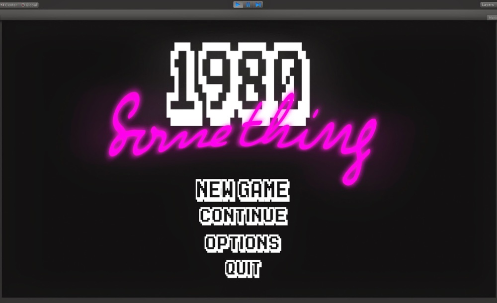
One I began work on is title "1980 Something". You play as a cop in the 80's on a path of revenge. I really love 80's action movies like Cobra and Lethal Weapon and wanted to make a 2d game with side scrolling platforming and shooting and brawling. It's super ambitious but I'm doing my best to see it through. I've made some good progress thus far and have hit a few snags and limitations but I have some decent melee in the game already and some good platforming stuff. I'm not a great artist so it's tough to create the characters and what not but progress is being made and I look forward to showing something in the future.

Thumb Wars

About a week ago I started work on another smaller game that I'm just calling "Thumb Wars" right now. It's a 3d thumb wrestling game. Initial prototypes are pretty solid and a lot of fun. Two people use one controller to thumb wrestle and I have high hopes for creating different "Hands" to choose from as characters and any other ridiculous ideas I can come up with. I plan on updating my blog with progress on both of these games.

Progression

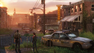
During the development of The Last of Us I began to ask myself where I saw myself in the future. Did I have that hover board I so dearly wanted? Probably not. More specifically where did I see myself in my career. I love visual effects. Always have and always will. The problems I've had the opportunity to solve through visual effects have always proven equally complicated and exciting. I'm always trying to challenge myself. If I get too comfortable doing something then I need to push myself. If I'm scared then I know I'm on the right track. It's in the spirit of challenge that I began pursuing a shift in career direction. One that also felt like a natural progression. This is how I ended up here. Where is here? I'm being too cryptic. Plainly, here is the discipline of game design. I've always been fascinated with game design and the intricacies within. The problems to solve are vast and meticulous and require many many loops of iteration. On top of this it calls upon your collective experience in life and academics. The great thing is that each of us have unique experience to call from giving us our own special ways to pose problems and solve them. Game design is one of the most challenging and unique disciplines I've encountered and I'm very fortunate to work with some of the best game designers in the industry. This is something I have put a lot of effort and though into. After shipping The Last of Us I knew I wanted to make the shift if the opportunity were presented to me. This brings us to now. As of this post I am now working primarily in game design. I'm always a little unsure of myself but it's always been a motivational factor to prove to myself that I can do it. I look forward to creating interesting and exciting experiences for players and benefiting from the immense talent that resides in our design department. I wouldn't be where I am if it weren't for the people I look to for inspiration and support. It's because of these people that I've come this far. I'm also super freaking lucky to work in a studio that has provided me with the opportunity for such growth. My blog will naturally reflect my current work and interests and while visual effects is not my primary focus now it will always be one of my biggest interests.

I also want to mention that my wife has always been my biggest supporter and without her I'd be lost.

Molotovs in The Last Of Us

Molotovs In The Last Of Us: Part I
One of the more interesting effects I worked on in this project were the Molotovs. In action it's just some fire effects and who hasn't see that before. What I find particularly interesting is what it took to bring it all together. There are many components to the Molotovs and while working on them I learned a ton about our scripting engine and how powerful it can be. But the point of this post isn't to talk up our scripting engine, rather to walk you through how we put it together in hopes of broadening your perception on what it takes to put something like this in the game.

Rootvars and Particler:
So, jumping right into it. Particler is our in house particle authoring tool. During production our dedicated fx programmer Marshall Robin added some new, really cool functionality to how we interact with our particles at runtime. Using a system referred to as rootvars, we were able to create variables in our expressions during the authoring stage that we could set the value for at runtime and update as well.

the rootvar __root.alpha here is being used as a float to modulate the opacity value of the particles

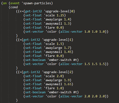
Using these I was able to make a single effect and manipulate attributes of the effect based on conditions I set in script. An example is demonstrated in the video below. The player can obtain upgrades by reading manuals that will increase the effectiveness of Molotovs the player creates. For instance the damage radius is increased with each upgrade. Rather than create an entirely new effect based on the upgrade, I've passed the upgrade level as an int and, based on that number, at creation I set conditions so I can set values in my single effect to represent the upgrade like sprite size and emitter radius among other visual aspects.


The concept for the Molotov and its need for flexibility:
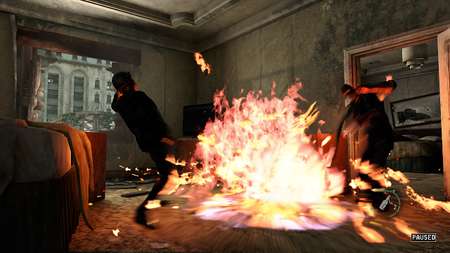
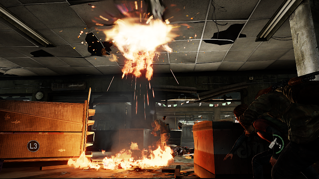
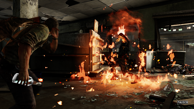
The easy way for the Molotov to work would have been the old method. In a specific file, we can define what effects to spawn specific to certain weapon types and explosions. This is an oversimplification of how that all works. For example, in this specific file there would be some definition for the general gameplay behavior of the Molotov and in this location there would be a space where we can define what single particle effect we would like to play when the Molotov explosion is triggered in gameplay. Molotov goes boom, spawn some effect. The simple way to create the Molotov would have been to simply say spawn my Molotov effect when this explosion happens. The Molotov however needed to be flexible. For instance after watching a lot of reference I noticed that the way it spawns differs greatly depending on the angle of the surface it explodes on. So we had four possible explosions that could be defined. One for the floor, one for walls, one for ceilings, and one for impacting characters directly.


Floor Impact Molotov
Ceiling Impact Molotov
Direct Hit on Enemy Impact Molotov
The fiery bits spit out by a Molotov would need to react based on the angle of the surface it impacted and take into account other information and conditions. On top of this the player would be able to upgrade the Molotov damage radius so the effects would have to reflect these upgrades. This all would have meant we would need to author a new effect for every upgrade possible for all four effects if we stuck with the traditional method. So I went with a more technical setup but far more flexible.

State Scripts:
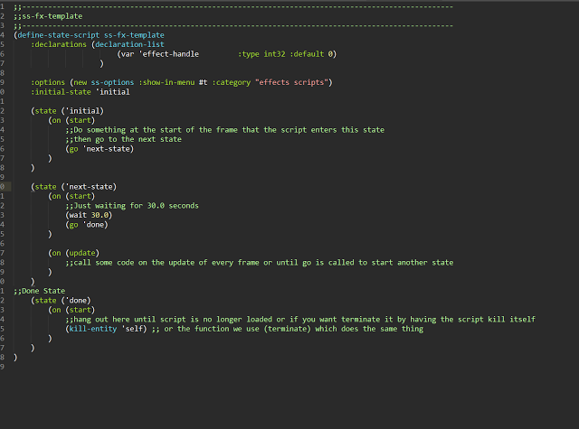
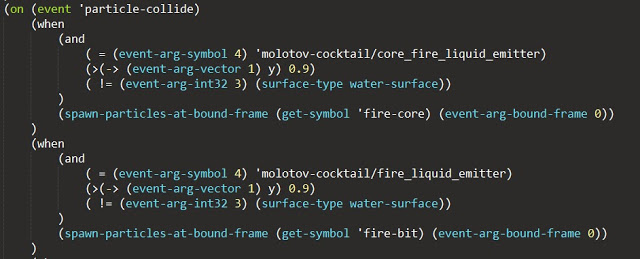
State scripts are built using our internal scripting language. The syntax is based on lisp. You can think of it like Unreal Script and LUA. A state script is very flexible and can be used for a number of tasks, ranging from controlling how objects behave when attacked to setting up logic for combat. I had used state scripts loosely on Uncharted 3 and had continued to become familiar with them as I saw a lot of potential for setting up effects using them. We also have a large number of user and programmer created functions that support them. When spawning an effect in particler we can send collision events that carry information that can be used by state scripts. So I'll detail the information I used to interpret the behavior for Molotovs.

State Script Example

Collision events and the state scripts for Molotovs:
So the most flexible way I could think to setup the Molotovs was to instead have a state script spawned in place of a particle effect and that state script would spawn the particle effect and control all the aspects of its behavior. So this is how It all went down.
  • Lead Programmer Travis Mcintosh setup the lower level code to spawn the state script and pass the script a world space position and a quat that I could use when spawning the effects. He also sent an event to the script so that I could have all the variables setup before spawning the effects. This created a one frame delay but you don't really notice it.
  • I created an effect for each of the 4 types of Molotov bursts that contained fiery particles that fly out and collide with surfaces. Each time a particle collides with some geo it sends out a collision event.
  • The script listens for these events and using the information contained within the event sets up some conditions to further control how the Molotov behaves. 
  • All 4 effects spawn the same effects when they collide with geo but each script determines how those parts behave differently.
  • There are 3 parts that result from the collision of the Molotovs components. The small fire bits. The large fire bits. And the smoke, light, and scorch all in one effect.
  • Using functions inside our scripting language I was able to check for the level upgrade set on the player at the time the Molotov script spawns.
  • I set rootvars for scale and rate along with the speed at which components flew away from the center of the Molotov.
  • Additionally I check the y component of the normal that the collision takes place at. If the value is greater than 0.8 I don't spawn the normal fire bit and instead spawn another effect to creates some simple spreading. This spreading is purely a visual thing and does not contribute to gameplay but it was a nice touch.
  • I also check the surface type of the collision. If it's water I don't spawn the fire. If it's deep snow I spawn a different scorch mark entirely. So it would look like the snow was melting.

Here is a quick run through of the Molotov being used in gameplay. I have character invincibility on and I also have some infinite ammo set so I can just demonstrate how all of this looks in execution.

Gameplay Demonstration: Molotov

Conclusion:
The Molotov was a huge learning experience for me and allowed to explore all of my options for implementation. In retrospect there are some things I wish I could have done early on knowing what I know now. As with all things, I learned a lot about our scripting engine and continue to use it to implement some crazy effects. There is no greater feeling than setting up a bunch of conditions and then watching it all work and happen right in front of you. Seeing people lob these bad boys at each other and just imagining all the crazy crap going on under the hood, it's great. In part 2, I'll go over how I used some of the same techniques to control how fire spreads in infected as they walk through fire elements of the Molotov.

VFX of The Last of Us: Lakeside

SPOILERS 
This post will reveal game footage and details that will spoil the game if you haven't played it.

Winter
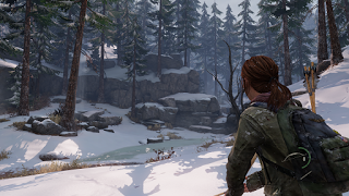
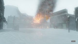
The winter section of the game we referred to as "Lakeside". The level posed some familiar challenges for snow based effects and some new ones. This snow had to feel hold and packed with fresh snow coming in and we also needed to reflect some changing weather patters as the level progressed. We wanted to reflect some old snow with the sun peeking through the clouds and hitting the surface. Giving off some warmth. Moving into an on coming storm and in the end a full fledged blizzard with low visibility. I spent a great deal of time on just the footprints which I detailed in a previous post so I won't elaborate on that here. Check out the video below to see some of the effects in action


Warm Calm
In the beginning of the level I wanted to convey a lot of random wind patterns as the wind moves throughout the trees and wooded area. I created some random gusts of loose snow clouds that get kicked up and flurries that blow out from small bushes. This helped to create a sense of movement while not being too heavy handed. I also created some loose snow effect that fall from branches as you move through the forest. One of the biggest issues for this area was due to the fact that once you shot the deer it would leave blood trails so you could track it. Each blood drop was ticking away at our particle memory in a significant way and at times players could use up all of the memory and the blood would stop spawning. There was no fancy trick for fixing this issue I simply had to scale back the number of effects being spawned and make the blood less frequent and larger. You might be asking yourself "Why is that deer bleeding so much?", well that's why.


Storm Chasing
For the white out blizzard I had some fun with implementation here. The biggest issue was that we needed reduced visibility and using particle for this is always a bad idea because of overdraw issues. Rather than placing a bazillion emitters and only placed a few in key places and instead attached an emitter to the player camera with the emitter oriented in world space. The emitter will update it's position with the camera but will not rotate with it. I setup a state script (ref to our internal scripting engine) that would control the whole camera parented effect. The reason for ding this was because you obviously don't want the emitter on while you are indoors. So I setup regions for the interiors and when the player walks into them I send events to the script and the script lerps values on the effect up and down respectively. this utilized some new tech we got from our dedicated effect programmer Marshall Robin. He exposed to us root data on our particle systems and in script we can set those values as long as we retain a handle to the effect in our script. Pretty cool. The issue was still that some of the larger gusts of cloud particles would still draw indoors. The solution for this wasn't perfect but worked well enough. For the shader I utilized a buffer we use for occluding rain so that rain doesn't draw indoors and under hanging objects that write to that buffer. I modulated the world space position of each pixel by this buffer which is also in world space and this prevented those pixel from drawing inside. It created a harsh edge so I had to do 4 taps to make a super super super cheap blur. Calling it a bur is almost offensive to blurring pixels because my samples are so low but the shader was getting too expensive so I tried to offset this restriction by adding some distortion to the edge as well. Again, it's not perfect but works well enough.

The Roof Is On Fire
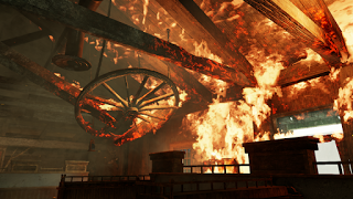
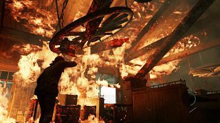
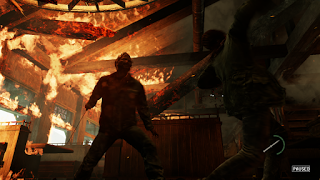
This was another area where I employed some heavy scripting for the effects. Once David comes in and knocks over the candles this resulted in a small fire spreading. In script I set this up in stages that way the fire wouldn't progress to the next stage until the player had stabbed David once and so on. I juggled the particle effects, spawning sounds, lights, material blending, and animated curtains as they burned as well. On top of this I also kept track of where the player stabbed David. On easy you can throw a brick at David and while he is stunned stab in from the front. I spawned blood effects on his clothes based on where he was stabbed so if for some reason you turned off the PS3 while in the middle of the fight and picked it up in the second stage he would still have blood where you last stabbed him. I don't think anyone will notice that. All sorts of fun keeping track of these variables and every time you think you have accounted for all of them you've undone something else. Honestly thought I really enjoy this aspect of things. I'm not sure why but it just feels that much more gratifying when you solve it but equally as stressful when you're getting close to ship and people are still finding bugs in your code.


Conclusion
So this level was a roller coaster down to the wire. This camera parented emitter thing, while saving me time in propagation, cost some some nights while I scripted its behavior. This level also taught me to let go. To not attach myself to certain aspects of what I'm trying to achieve at the cost of shipping something half finished or buggy. I also learned not to try to script one thing that could control a lot of things. Smaller script for specific goals is easier to manage and easier for others to parse when you need help.

VFX of The Last of Us: Bills Town

Subtlety
This is a difficult thing to convey when working with visual effects. You want to create some movement and visible interest but it also needs to feel appropriate given the context of the environment. In The Last of Us this was particularly difficult because the weather wasn't always in some extreme state. For the most part things needed to feel calm and peaceful while being juxtaposed with horrific realities happening around you. I think it's because of this setting and tone that fools you into thinking you're safe but you know better. This brings me to Lincoln or as we referred to it, Bills Town.
Life Goes On
In Bill's Town there's only Bill, and of course the infected wandering around. No electricity, no human life. This was a constant theme throughout the game and it required us to explore other ways to create movement and life. We did this though things that weren't as obvious as animals and things of that nature. We used small swarms of flies and gnats that you end up walking through, grasshoppers that jump back and forth and loose pieces of paper trash that fly around in the wind to name a few. I personally had to really think about how to create the movement without it being intrusive or out of place. I borrowed a technique from one of our lead effects artist Eben Cook where I would take a still from the level with no effects in it yet and do some paint overs to try to imagine what effects would look good in areas. This helped a ton to see what worked and what didn't. I wanted to describe this because I think it's important to explain that visual effects in a game are not something that just get plopped down without any forethought. There are some effects that you have on hand and you know they will work well in many areas but before we lay them down we put a deal of thought into how it all fits together. This game was a great practice in restraint as well. An effects artist we could put any number of things into a scene to convey movement and so forth but you also need to be able to look at something and say "It only needs this one thing." and be alright with that. Just because we can doesn't mean we should.

Wind Effects
We have a wind system in the game that controls how things like trees and other geo behave to simulate the appearance of wind. In previous games we have created effects that best match what this looks like to us, but we were always just eyeballing it. We had to orient our emitters in the direction of what we perceived the wind to be and while this was fine it could be a little slow at times and they didn't always remain consistent. In this game we decided to ask for the ability to fetch the wind direction and strength from our global wind system so that we could use those values to control some of the behavior in our effects. I created a simple script that grabbed the wind direction and intensity and passed it to one of our global wind fields we exported from Maya. This allowed us to put things like leaves falling from trees and any other particles we wanted to have flowing in the wind wherever we wanted without having to worry about emitter orientation. So in Bills town I created a number of effects to take advantage of this, like grass and dusty dirt that gets kicked up randomly.

I created the video below to demonstrate some of these concepts at play. Ranging from subtle wind effects to in you face decapitation effects for the infected. There are spoilers so be warned if you haven't played the game yet.

Deep Snow Prints

Spoiler Warning!!!!!!!!!!!!!!!!!!
Be aware that the video below shows some footage that would be a spoiler for someone who hasn't played the game yet. I apologize for that.

Splash!
Long ago in the before time we didn't have a way to artistically control the footprints characters could leave on surfaces. The footprints in Uncharted 2 were smaller in scope and artists were limited in what they could do with them. Since then we have had some considerable support in a system that allows us to spawn effects based on collision data from objects in the game. Using joints in the game we can cast rays from joints that probe surfaces and use that information to test some conditions to spawn effects once those conditions are satisfied. We call this system the Splasher System. Originally it was just for creating splash effects for characters in water but it's a lot more intricate now. The splashers are something I'd like to go into more detail on at a later point if I'm allowed to. It's a great system but on the PS3 it became quite expensive and we had to scale back how many characters and objects used this system.

Projected Particles
One of the greatest things we have is the ability to project materials onto objects using our particle systems to generate the projections. This sounds like a decal system and in it's most basic description, it is. Our Dedicated effects programmer Marshall Robin, during uncharted 3 developed for us the ability to spawn projected particle cubes that utilize a number of parameters to project materials that we author onto surfaces. For example we can use this system to write directly to our destination normal buffer. This buffer takes the normal value of every pixel in screen space and writes to this buffer. Out projected particles directly perturb this buffer. Our lead effects artist Keith Guerrette, used this technique when creating the sand footprints in Uncharted 3. They can animate and do all sorts of great stuff. We can also draw these projected particles to the same buffers we draw all of our other particles to. So we can draw projected color based materials onto surfaces which is very much like the decals you are used to seeing. There is a lot of overdraw cost in these projected cubes so we don't like to use them all over the place just where it will have the greatest impact visually and where surfaces tend to have a lot of deformation. In the video I put together you'll see the outline of some cubes and those are the projected particles.

The Materials
We are lucky enough to have our own node based shader authoring tool. If you've ever used UDK's material editor it's a lot like that. Knowing we can only project a flag image onto the surface I used a technique that in UDK is referred to as bump offsetting. The idea is that you can use the camera direction to bias your original uv values modulated by some constants to create the illusion of parallax. The camera direction vector is a unit vector that ranges from -1 to 1. This is ideal because uv coordinates are commonly in tangent space which typically range from -1 to 1 as well. Of course you can push the values to whatever ranges you want but you would soon find the problem with that. The camera direction is a vec3 and I really only need 2 of the components from the camera direction. The x component and the y component. So I separate all three and recombine x and y back into another vector that is only x and y.


Using these vectors I multiplied them by a texture of a deep simple impression I made in Maya. The texture is the equivalent of a displacement map. By multiplying the camera direction vectors by the texture I create a more complicated and interesting shape of parallax per pixel. Now, what to use these crazy uv's on? I used the displacement map texture to create the illusion of shadowing inside the pit of the print. One of the unique things about our shader authoring tool is that we can define how our alpha is applied. This is similar to Photoshop layer stylings. You know things like multiplicative and additive and so on. The difference being that our options don't have those kinds of presets so we need to know how that alpha blending works. The simple version of what we have to work with is the source pixel (the pixel we are trying to draw) and the destination pixel (the pixel that is already there). Then we define some arithmetic on each of those alpha blending attributes and then by default the result of those two get added together. The majority of our materials multiply the source pixel by 1 so the alpha we are trying to draw just remains as is and then we multiply the destination pixel by one minus the source alpha. So the inverse of our alpha we are drawing. I didn't want to try to create any color of the footprints beyond what was already being drawn there. So the only color in my material is the shadow for the deeper parts of the print to make it look darker. For the alpha blending I set my source alpha to be multiplied by the destination pixels color. So now my alpha has within it the color value of the pixel that is already there. Then my destination alpha is multiplied by 1 minus the source alpha. Since my source alpha has within it the color of the destination pixel I don't want twice the color value when the two values are added together. That's a little complicated I know but totally worth it.


In Conclusion
There are some other things I did to create the prints but the bulk is being done in that one material with the fake parallax. The video will quickly demonstrate how the material is being modulated by a float to control how deep the parallax goes. These prints were important because we couldn't create any dynamic displacement of the geo and the player needed to have something to clearly track the deer. I'm proud of how these prints turned out. We tried to create prints like this for Ellie and I spent a good deal of time on them but it was difficult to make it look like she was leaving long trails and tracks in the snow. So I opted for the prints that write to the destination normal buffer to make it look like long streaks in the snow. Anyway, enjoy the video.

Cockroaches in The Last of Us

Spoiler Free I promise
(Unless you count the roaches as a spoiler)


These little guys might go unnoticed in the game but I am particularly proud of them. This was a tag team effort between Eben Cook and I. With a shout out to Nick Lance and Kurt Margenau a couple of awesome designers I work with. Sometimes our effects team might conceptualize an idea but we don't always have the means to create what we want as it requires support from programmers and it's hard to justify pulling a programmer on to something that most likely is not worth their time. I had been exploring our scripting engine in more depth since the end of Uncharted 3 where I had begun using it quite extensively. It's a very flexible scripting engine similar to Unreal Script and LUA based on LISP. I like it. Let me just put that out there. I love things like this because it allows me to think in ways I may not have before. I always like when there is this complex problem to solve and when I come up with a solution I like to admire it's intricacy. Our dedicated effects programmer Marshall Robin, shortly after Uncharted 3, had given us the ability to declare variables in the root data of our particle systems. These variables could be used in our expression when authoring our effects and we could set the values of these variables at runtime. What all this means is we could change the way our particles behaved on the fly. Muahaha. So with all of this in mind Eben and I thought "You know we could totally make some cockroaches that scurry away in some fashion." So Eben setup the cockroaches. They are aligned with their velocity and while they are not being affected by anything they are just randomly moving about based on some expressions Eben setup in the effect. This is where the root data variables (Rootvars as we refer to them) come into play. We basically have this boolean value in the expression that while set to 0 will have them acting normally just moving about and then when it gets flipped to 1 it triggers a condition in the expression to make them scurry in a direction along the z axis of the particle spawner. We simply add some spawners using our level propagation tool and face their z axes in the direction we want them to scurry in.

The next stage is where I had some fun. So I have all the pieces of the puzzle in front of me. I have a set of functions our designers use for other gameplay purposes but I know they will be what I need to get these roaches working. Additionally I didn't want the script I made to be something we could only use once. I wanted it to be something that any other effects artist could just throw into a level and it would do all the work. To do this I needed to be able to let the artist specify the name of the spawners in the level to perform operations on and I had to allow for any number of spawners. I did set a limit of 100 spawners in the script but if we ever had that many in a level it would be insane. I think the most we ever got up to was 8 or 10. The script spawner allows for a user to specify data directly on the spawner in our propagation tool. So the artist just enters the names of all the spawners for the roaches on the script spawner. For the artist that's it. That's all they have to do. The script itself contains two sections. The first creates a symbol array that we refer to as a group. So the script checks the data on the spawner I mentioned and if that data is specified it adds that roach spawner symbol name to the group. The function that does most of the work here is basically a while loop with a counter. The next section is where the real work is being done. Now that I have a group of symbols I use some functions to create some conditions for the script to check on those symbols every frame. I check the distance between the player and the roach spawner. I check to see if the roach spawner is within a specified radius from the center of the screen. and I check to see if the flashlight state is on. If all three conditions are satisfied it sets the boolean switch (Rootvar) on the roach spawner that has met all of the conditions to 1 and the roaches go scurrying away. The first time I saw it working I pooped a little.

So that's how all that works. It might sound expensive but it was all actually relatively cheap to run because it wasn't all that complex on the runtime side. Of course the more spawners we iterate over the more expensive it would become but it never got to that point and we were always mindful of that. The reason why I loved this whole setup so much was because of what it represents. It represents how flexible our tools have become to allow us to fully realize an effect without having to request any tool support. All the pieces to solve the puzzle and many others like it are at our disposal. While the end result is just some roaches, the concepts we learned and put into practice here have larger applications across other areas when creating effects and completing effects related tasks. This level of creative problem solving takes shape when the tools expose more access to the inner workings of the effects to the artist. I will say that we are super freaking lucky to have the support we do because if it weren't for Marshall exposing the root data to us we couldn't do this and a lot of other things. Also big thanks to Kurt and Nick for showing me cleaner and smarter ways to write the code for the scripts.